Tuesday, March 13, 2012

Modifying Shapes: Photoshop

Before
After
We worked with shapes in Photoshop, and altered the shape by color, styles, filters, and images.  Each alteration changed the connotation of the same shape, portraying different color schemes, affects, and visual weights that alter the meaning of each image.

I started with a black snail shape.  For the first step, I changed the color to blue.  I'm not sure what this color conveys with the overall layout of the design (there really wasn't a layout), but I could have created a gradient with color to change the shape even further. 

For the styles step, I chose a "tye-die-esque" fill to fill the shape.  Adding a pattern to a shape changes the overall perception of the piece.  The graphic no longer is about the shape, but about the design of the pattern itself.  A style change can completely alter the meaning the shape is conveying.  However, if this shape and style were to be used on a larger scale, with more than one shape, it could be too dramatic and "over-the-top" for an image and distract the viewer from the message (connotation). 

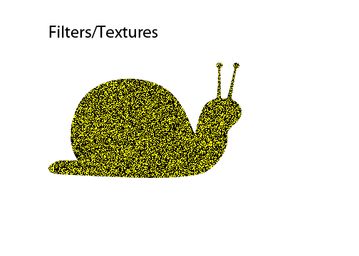
The texture addition to the same shape changes the perception of the image again.  Applying a texture to an image creates a touch sensory that attracts the viewer.  The harsh static against the yellow background fill gives the shape an entirely new meaning.

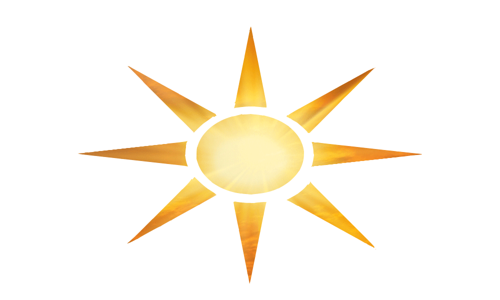
The image that I inserted into a new shape changes the perspective of the shape entirely.  Before, the icon was black, without any textures or colors.  When I inserted the background image, inverted the selection, and deleted the remaining background, the shape became an icon that is universally known: a sun.  The colors and hues of the filled image create a lifelike affect, and I made sure to put the placement of the picture in the center of the sun, in order for the colors to move from light to dark.  The element stands out clearly and concisely, and creates the look I was aiming for (attributes).

Gestalt Assignment


For the closure symbols, I created two images that revealed a closure aspect (the first one is not that good).  I liked the second image, because by horizontally and vertically aligning 8 black, bold crosses, I also created three white rectangles, and this pattern could continue and continue.  The thematic goal was to create an image inside of an image, and in the second closure design, I created two different images, depending on the viewers perspective of the design (connotation).  The simple space and placement between each shape creates the entire image.
For the proximity design, we had to create two images that convey space and...proximity.  I created horizontally and vertically aligned bold circles to convey a bold statement and closeness.  Each placement of the circle is symmetrically identical to the next, creating a harmonious image.  For the second image, the squares are not bold, and they are more vertically aligned then he circles.  The two columns of squares are evenly spaced.  If I would have made the squares bold, the perception of the alignment and the proximity of the two images would have changed dramatically. 


I decided to make the background black, and the images white, to change the appearance of the design.  The dark background with the popping white, symmetrical circles changes the theme of the project, but not in a bad way.  The change of black and white makes the image more visually stimulating.  I created 13 identical circles that are spaced evenly in a circle.  The space between each circle, with the black space surrounding them, creates an extreme similarity in the design that is hard to miss.  A universal harmony is created by a circle.


This design is way too simple.  I could have created a more stimulating image for the continuity image.  The linework could have been changed (bolded, textured) to create different attributes to the image.  When I thought of continuity, I instantly thought of Algebra and the continuing lines we use in graphs.  Although the design is simple, the right angles created by the connecting and descending lines give the image a continuous feel.  The placement of the top "step" and the bottom "step" allow the eye to wander and continue the unseen path.  The concept was simple, but still follows the overall theme of the project.  The message is clearly demonstrated.  The lines look like descending steps, which in our society symbolizes continuity and walking, and the perspective changes with each viewer (connotation).

Monday, March 12, 2012

Special Topics Assignment: War/Conflict

War/Conflict

Charity and I were assigned the War/Conflict topic.  Charity made 5 amazing visuals for the project, and I created this Power Point, which parallels the visuals in the articles we read.  In my article, there was a link to a NY Times article that showed the pictures of all the dead American soldiers from the Iraq War in small cubic pictures.  This visual gave the reader the power to decide what to see and how they wanted to see it because with every small square came a new picture of a dead soldier.  We wanted to portray this with our PP, so I picked a main image (slide 2) and divided it up randomly with action squares.  Each square that a reader chose would take them to a different slide, and after you click the other images, it would bring you back to the main slide.  

Analyzing based on connotation, attributes, and placement:

War and conflict is pretty self-explanatory, but as we read in our articles, I knew I needed to create a PowerPoint that shows shocking images to change the perspectives of different viewers.  The First Slide was opened on one computer, to introduce our title and give the emotional affect of the large and symbolic graphic.  On the other computer, I started the presentation from the second slide, putting it in kiosk view (so the only way the viewer can interact with the slides is if they click the image, not click to the next slide).  As I mentioned above, I filled the image with 7 action squares, all linked to a different slide.  The disorganized placement of each square on the image creates a chaos with the viewers eye, also symbolizing the chaos of war and terror.  The entire shape was not a perfect square, which I think contributed to the disorganized emotional pull.

The theme was dark and emotional, and we used the same colors and fonts within each slide to give it a cohesive feel (connotation).  Each image was enlarged, cropped, placed center on the page, and I added a glow edge to each image as well.  The theme could be too specific, because we are only focusing on the Iraq war in these photos.  However, I think we did an excellent job sticking to our theme, using color choices, font choices, and layout and placement choices to convey the theme of war and conflict.


I wanted to use as little type as necessary, only including the captions and citations, to convey the emotions of each image.  I placed each image center on the page, and made it as large as possible in order to gain the attention of the viewer.  Each of these elements: connotation, attributes, and placement, all played a large part in our design and theme of the project, and our goal of conveying our War message.


Pick A Square