Tuesday, April 10, 2012
Color - HARTS project
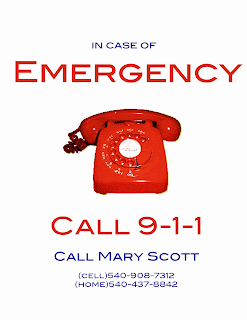
In connection with the HARTS project we're completing, we had to do a color concept with one of our posters we had to make. Our group decided to do the emergency posters, which are relatively simple, but can be updated with color, composition, placement, emphasis and different components.
I altered the color scheme of the two versions of the poster to change the perception of each. For the first version, I used primary colors (red, blue, yellow) to create harmony in the poster. The red phone has a drop shadow of yellow, and I centered and enlarged the "emergency" and "call 911" to emphasize their importance. This poster clearly demonstrates that it is an emergency poster, because red is usually associated with emergency and urgency (connotation). The theme is bold, but could be altered to show even more emphasis (enlarge image, get new image, change font, change arrangement). The linework could definitely be thickened in order to establish the element's aesthetic integrity. To improve on the icon's attributes, I can change the logo to appeal to a broader audience.
For the second poster, I used a secondary colors scheme (orange, green, purple) and used the same center-alignment as the first poster. The change in hues dramatically effects the message of the poster. Before, the red hues expressed an emergency connotation, but with the secondary colors, the poster appears less alarming. In our society, we do not attribute orange and purple hues as alarming or important, and therefore this choice in color scheme confuses the audience. The placement of the larger fonts and the image, no matter how confusing the colors are to our senses, emphasizes the importance of the poster and can be easily read from a distance (which is important, because these posters will be used in real-life situations with volunteers).
Icons and Supporting Elements: Infographic of Conceptual Framework
Final Project: Infographics
Icons Used/Edited for Project


Here is our completed infographic containing the eleven competencies (and icons) that the educational professional needs to demonstrate. Rachel Dawson and I completed the project together; I worked on the icons and helped with the layout design of the final poster, and Rachel created the final poster (she is much better on Photoshop than I am).
With the overall design, we wanted to convey that this poster was about education, so we decided to create a stack of books, with each book having the name, description, and icon on each book spine. Rachel changed the placement, font, and color of each book to give it a realistic feel and to give the audience a different perception of "typical" educational posters. The vertical alignment of the poster allows the information to be easily read and understood from a distance. The attributes of the poster make it universally recognizable; books=education. If we had a larger poster size to work with, we could have worked more on creating 3D books and larger font sizes.
Every sub-component is working toward the same thematic goal: an educational professional. Every poster always needs improvement, so as I said before, we could adjust the color, font and placement of each book to better reflect the message of the poster. Overall, I think our poster looks professional, and it conveys the message we were told to convey.
Subscribe to:
Comments (Atom)


