Tuesday, April 10, 2012
Color - HARTS project
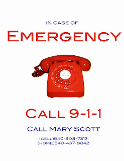
In connection with the HARTS project we're completing, we had to do a color concept with one of our posters we had to make. Our group decided to do the emergency posters, which are relatively simple, but can be updated with color, composition, placement, emphasis and different components.
I altered the color scheme of the two versions of the poster to change the perception of each. For the first version, I used primary colors (red, blue, yellow) to create harmony in the poster. The red phone has a drop shadow of yellow, and I centered and enlarged the "emergency" and "call 911" to emphasize their importance. This poster clearly demonstrates that it is an emergency poster, because red is usually associated with emergency and urgency (connotation). The theme is bold, but could be altered to show even more emphasis (enlarge image, get new image, change font, change arrangement). The linework could definitely be thickened in order to establish the element's aesthetic integrity. To improve on the icon's attributes, I can change the logo to appeal to a broader audience.
For the second poster, I used a secondary colors scheme (orange, green, purple) and used the same center-alignment as the first poster. The change in hues dramatically effects the message of the poster. Before, the red hues expressed an emergency connotation, but with the secondary colors, the poster appears less alarming. In our society, we do not attribute orange and purple hues as alarming or important, and therefore this choice in color scheme confuses the audience. The placement of the larger fonts and the image, no matter how confusing the colors are to our senses, emphasizes the importance of the poster and can be easily read from a distance (which is important, because these posters will be used in real-life situations with volunteers).
Subscribe to:
Post Comments (Atom)


No comments:
Post a Comment